Customize your branding and colors to make your Monyverse sub-community your own. Your logo and theme colors will display across your community.
Wondering what size to make your Article or Event headers? Want to know where to put the text? Not sure what size logo to upload?
We put together this cheat sheet to help you bring a little bit of your brand’s flair to every corner of your Community!
How to Add Your Network Branding
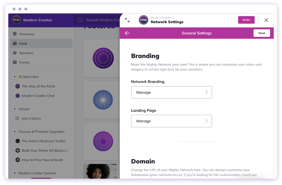
From Network Settings > General Settings > Branding > Network Branding, you can add a logo and a network image or video.
For your logo, we recommend uploading an image with square dimensions that is at least 500px by 500px. the logo will be resized into a round shape in most places where it appears across your Community.
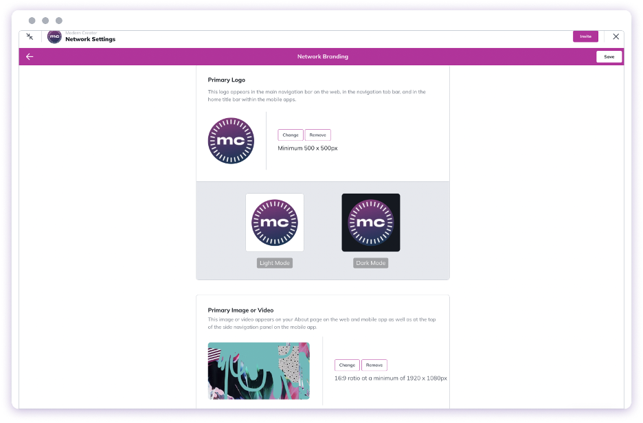
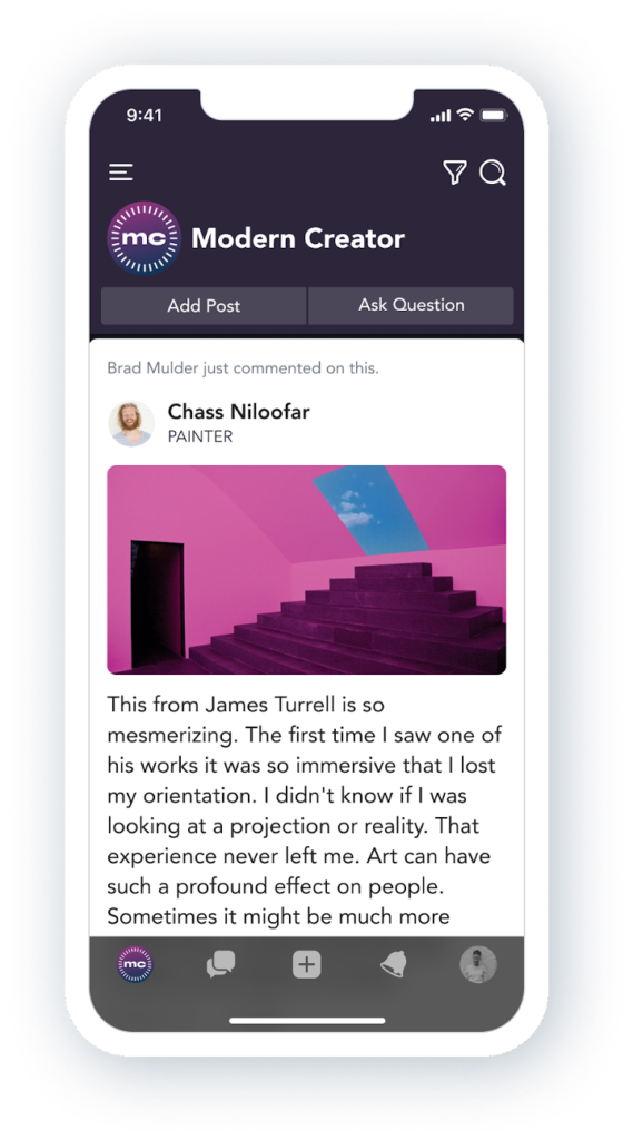
The network image or video that you add will appear on the About page within your network and inside the mobile apps when someone taps to open up the left navigation, as you can see below.
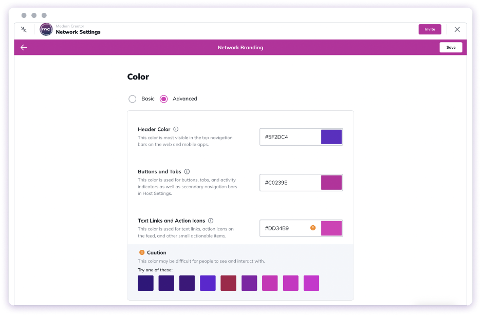
How to Customize Your Colors or Theme
You can change the primary color of your Community by going to Network Settings > General Settings > Network Branding. There you will see the option to choose a single primary color for your buttons, tabs, text links, and action icons in your Community. Your header color will be white by default.
If you are looking for more customization of colors in your Community, you can switch from Basic to Advanced mode and select a color for each of the following:
- Header (the top navigation bars on the web and mobile app)
- Buttons and tabs
- Text links and icons
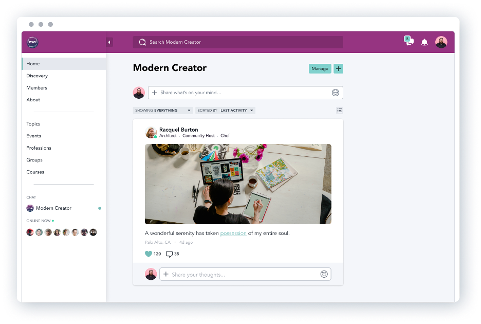
When using a light color for the header, anything that appears on top of this color, such as icons, automatically appears darker, as you can see here:
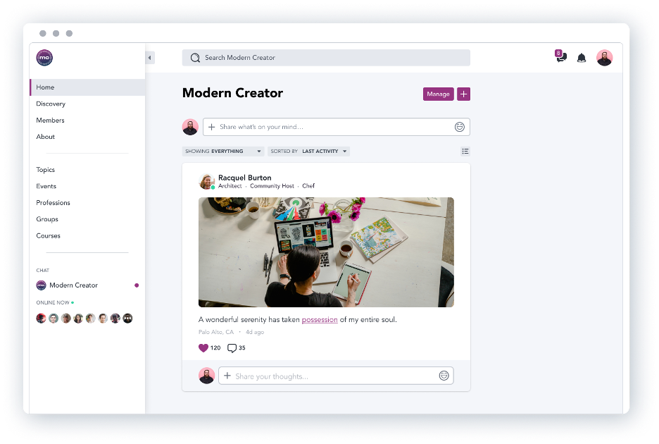
When using a light color for buttons and tabs, the characters that appear on top automatically appear darker, as you can see here:
Here’s a look at what Dark and Light themes look like on mobile: